Buildings are full of sensors. Facilities managers are still wasting hours chasing false alarms. MAIStro was designed to close that gap — turning raw building data into AI-powered decisions people could act on in a single tap.
Scenera builds BlindEye — a privacy-first spatial sensor that captures occupancy, motion, heat, and environmental data without ever recording an image. No footage. No faces. Just behavioral intelligence from the space itself.
The opportunity was significant: commercial buildings, residential complexes, retail environments — all generating a constant stream of sensor data. The problem was equally significant: none of it was actionable. Facilities managers had dashboards full of readings and no clear answer to the only question that mattered every morning — what do I need to do today?
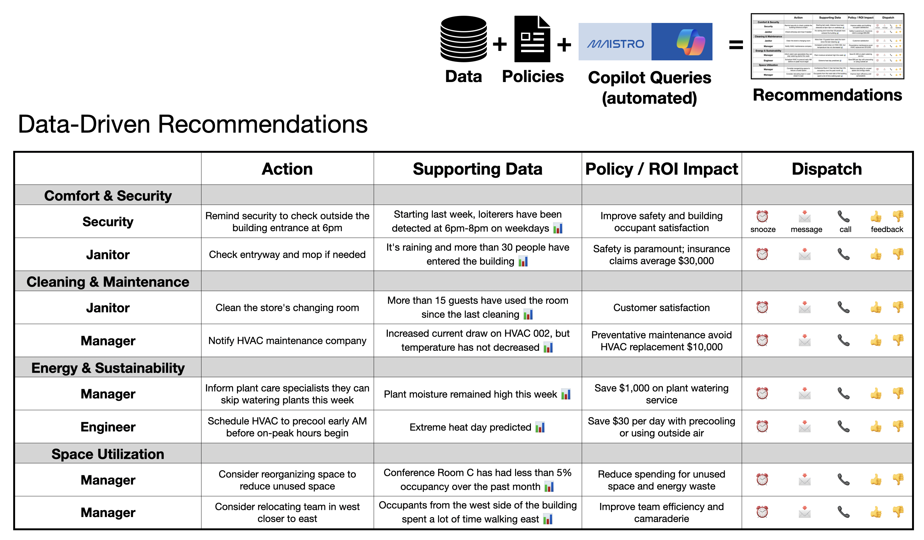
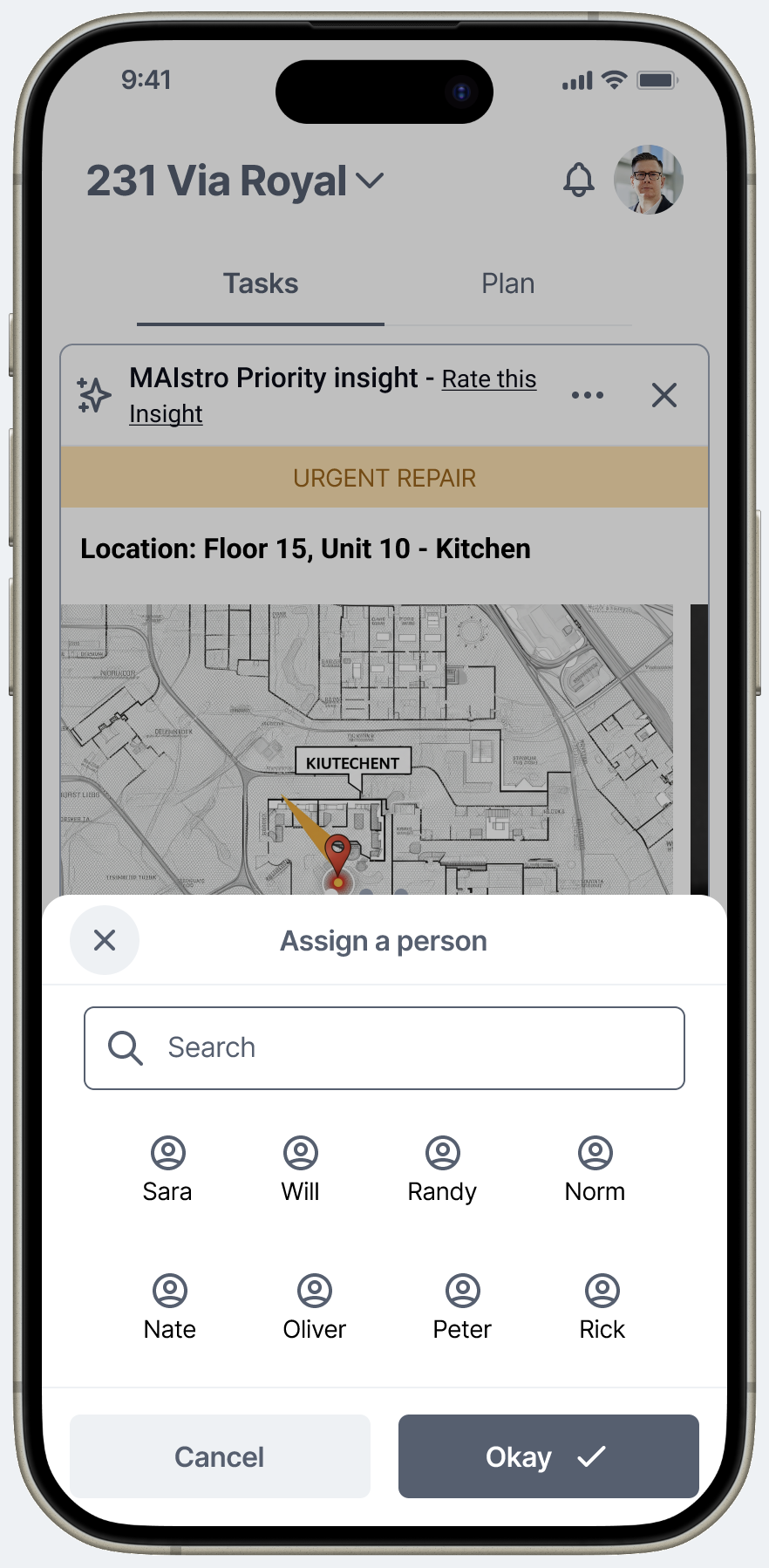
MAIStro was designed to answer that question. An AI copilot that translates building data into prioritized, dispatachable recommendations — and learns to get smarter over time.
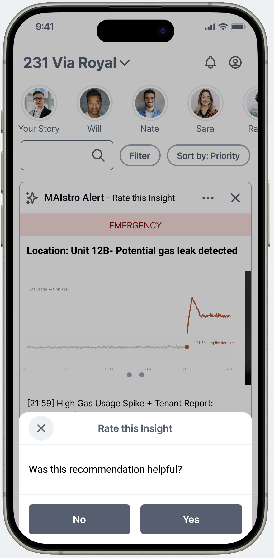
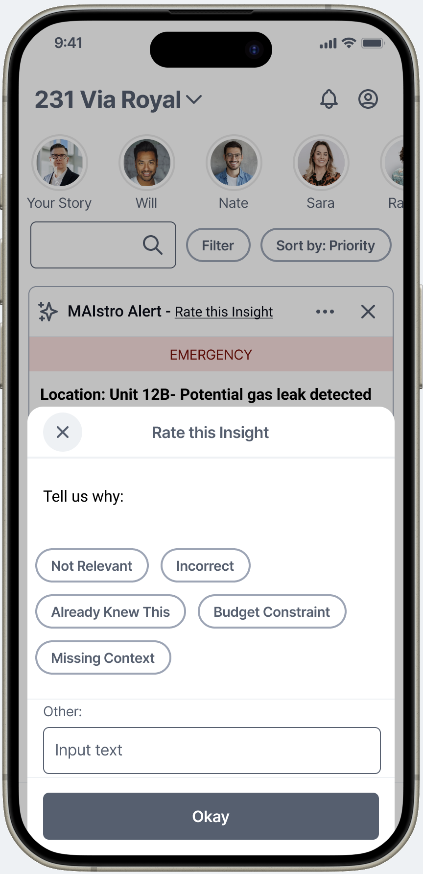
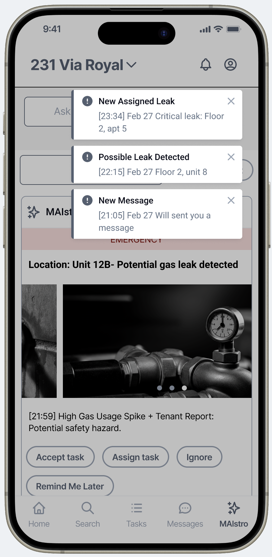
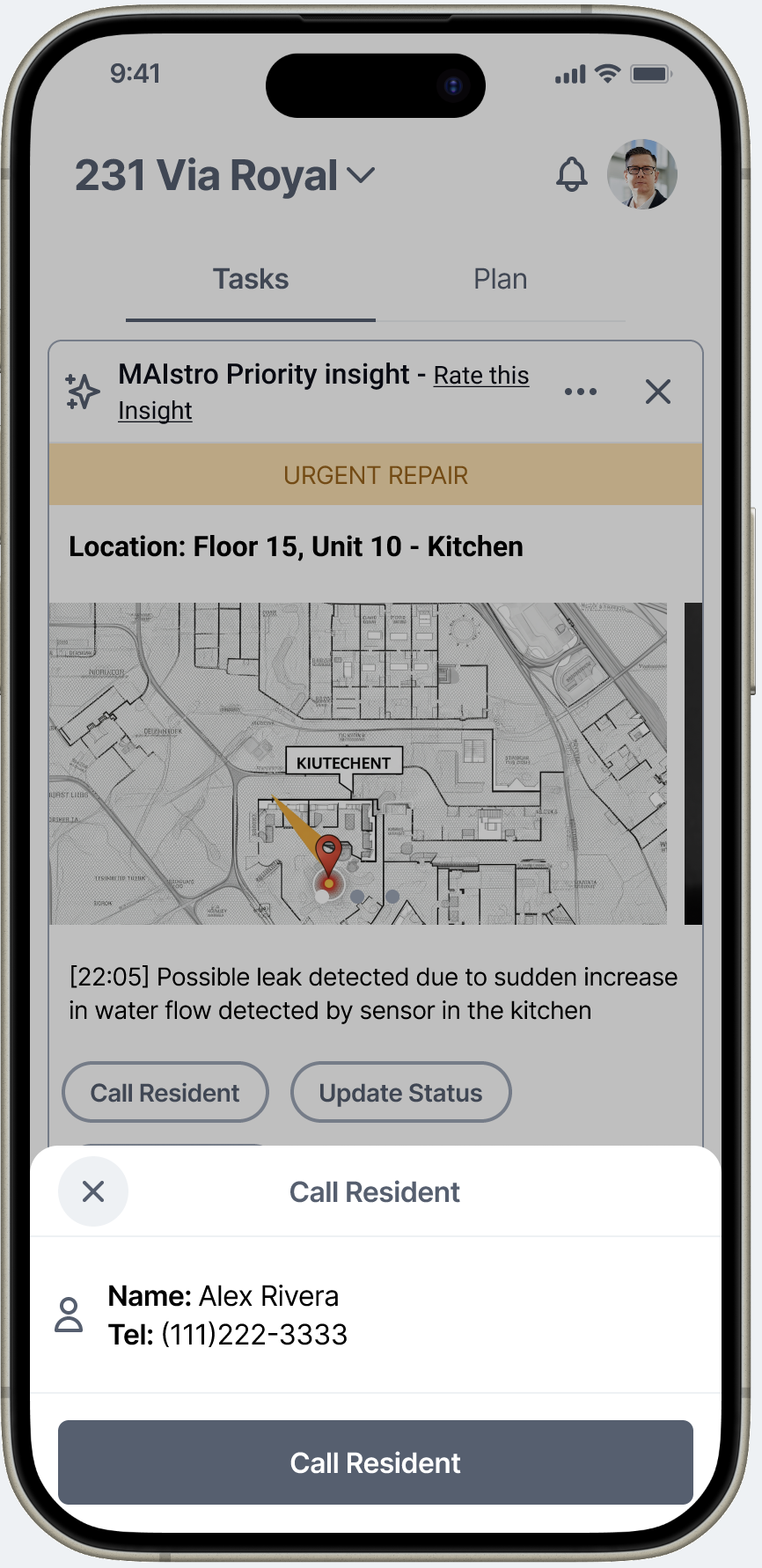
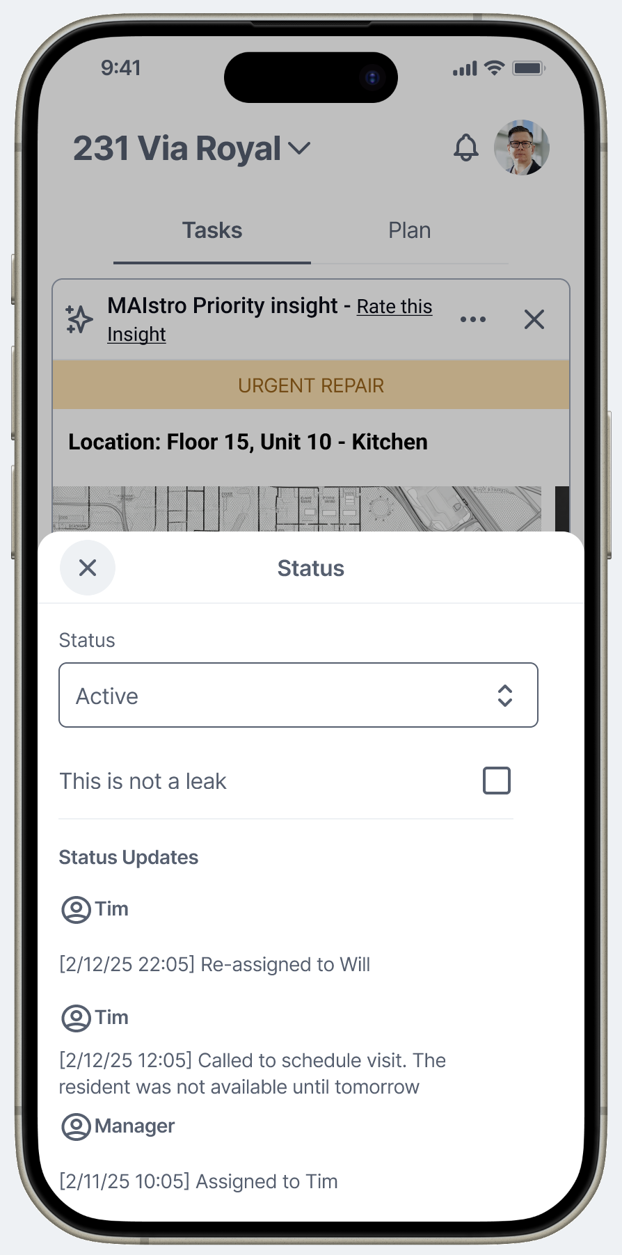
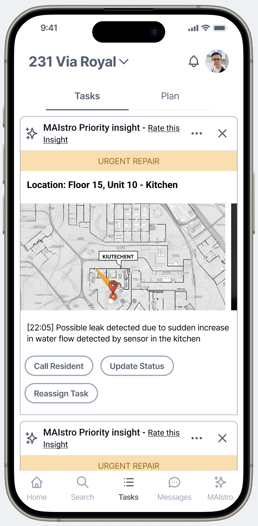
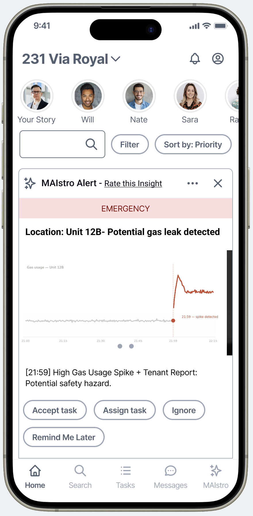
MAIStro home feed — EMERGENCY state. The card shows the actual sensor data that triggered the alert, so the manager understands why before they act.
Sr. Product Designer — sole designer on the project. Owned strategy, research, flows, prototype, and usability testing end to end.
Engineering team (attended daily standups). CEO and product leadership. Direct access to client meetings for user context.
PoC validation for an AI-first product in a competitive market. The research and prototype were Scenera's primary artifact for attracting clients — including a CRETech 2024 conference demo.
Oct – Dec 2024. Greenfield — no prior design artifacts, no design system, no established patterns to build from.
I'd spent years conducting usability sessions at Intuit — two-way mirror rooms, live moderation, my own prototypes. What I hadn't done was own the full research cycle: defining the personas, writing the screener, building the research instrument, synthesizing the findings, and presenting them as strategic recommendations.
This was that project. Using Userlytics, I built the research program from the ground up — screener, interview script, the Figma prototype used as the test artifact, and the moderated sessions themselves with facilities managers. When the sessions were complete, I used AI to compress the synthesis process: what typically takes a research team weeks, I delivered in 24 hours.
I sent the full findings deck to my contact at Userlytics — a professional UX researcher — as a gut-check before presenting to the team. Her reaction: she couldn't believe it was my first time running a research program end to end. That mattered to me, but what mattered more was what the data said.
The core product framework — what we built the prototype around and validated in research.
Facilities managers with decades of experience couldn't see what an AI copilot could add to their workflow — until they described their biggest frustration. They were losing hours to sensor ghost alerts. Check the reported leak in apartment 5, find a baby splashing in a bathtub. That wasted trip — multiplied across a building, across a week — is where trust in sensor systems dies.
The revelation wasn't that users wanted AI. It was that AI needed to earn its place by doing the narrow, pattern-recognition work that humans waste the most time on. Win small. Reduce false alarms. Surface the specific security clip. Flag the loading zone that's been blocked too long. Prove value in the tedious jobs first. Then expand.
Moderated prototype sessions with real facilities managers. 30-minute structured interviews: role context, live prototype demo, focused feedback, open discussion.
Users rated the concept "very useful" and predicted it could replace multiple existing tools. The AI recommendations feature and the ease of task dispatch were the standout moments.
AI can't ask for trust. It has to demonstrate value on small, specific jobs before users will open up to it on bigger ones.
The more users can shape the system's behavior, the more they'll trust its output. Feedback mechanisms aren't polish — they're infrastructure.
Every insight needs a clear next step. The value isn't in surfacing information — it's in connecting information to a decision.
A narrow, specific AI suggestion feels credible. A broad, generic AI prompt feels overwhelming. Narrower is almost always better — especially early.
B2B tools don't have to feel like enterprise software. When the interaction model borrows from something users already understand, onboarding happens before training does.
Testing revealed that users needed to feel in control of the AI's behavior before they'd rely on it. The feedback mechanism on every recommendation — thumbs up/down, snooze, dismiss — isn't a UX nicety. It's the training loop. User signals teach the system which patterns are genuine vs. noise, gradually reducing false positives and increasing the quality of recommendations. Without it, the AI is static. With it, the AI gets better the more it's used. This was the design decision that most directly addressed the trust problem.
Step 1 — quick signal
Step 2 — structured reason chips
Early framing assumed a general "ask AI anything" interface. Testing killed that idea fast. Users with decades of experience couldn't frame what to ask — AI felt too abstract. The design shift: replace open buckets with specific, contextual prompt suggestions tied to what the user is currently looking at. "Your HVAC on Floor 3 has been running at 94% for 6 days — ask AI why?" is infinitely more actionable than "What would you like to know?" Narrow scope signals that the AI actually knows something specific, which is what builds credibility.
Alerts are location-specific and time-stamped — not abstract AI warnings. Every prompt is grounded in a building event the manager already owns.
Facilities management is a coordination job. A recommendation that surfaces a problem but requires switching to a different tool to act on it loses in the field. Every MAIStro recommendation includes an inline dispatch layer: assign to a team member, call the resident, update status, reassign. Data → Decision → Action in a single flow. This was directly informed by the false positive pattern: the pain wasn't just the wrong alert — it was the wasted workflow that followed. Closing that loop in the interface was the fix.
The task view includes a floor plan with the alert location pinned — because a facilities manager's first question is always "where exactly?" Giving them spatial context before they dispatch saves a trip to check which unit, which floor, which zone. The system answers the question before they ask it.
One more deliberate choice: EMERGENCY-severity alerts show the actual sensor data that triggered them — not a stock photo, not a generic icon. A gas spike alert surfaces an inline chart of gas usage with the anomaly marked at its exact timestamp. The manager sees the pattern the sensor caught before they read a single word of the description. That's contextual data as a design decision: the interface doesn't just tell you something is wrong, it shows you the evidence. Standard alerts use icons for efficiency — but when the stakes are high enough to dispatch a team, the system shows its work.
Floor plan pins the location → resident contact surfaces inline → audit trail closes the false positive loop
The initial instinct was to organize the platform around sensor types or data streams. Testing showed that's not how facilities managers navigate their work. They think in domains: occupancy, energy, comfort and security, cleaning and maintenance, budgeting. Each domain maps to a distinct responsibility, a different type of decision, and a different set of stakeholders. Organizing around their mental model — not the system's architecture — made the platform immediately familiar even to users who'd never seen it before.
The full task view — building intelligence organized around how facilities managers think, not how sensors are categorized.
The alert stream could have been designed as a dashboard, a notification list, or a ticketing queue. I chose a feed pattern — and that decision was validated loudly in usability testing. Multiple participants said unprompted that the interface felt "familiar," and the ease of use scores reflected it: 5/5 across all participants, zero blockers.
The reasoning: facilities managers don't have time to learn new software paradigms. They already know how to read a feed. Every building alert as a card — team members visible at the top, priority filters accessible, actions inline — maps directly to how they already scan information on their phone. The learning curve disappeared because the mental model was already there. This wasn't coincidence. It was a deliberate decision to borrow trust from a pattern users had already internalized.
Feed pattern — familiar, scannable, everything one tap away
EMERGENCY severity — the card shows the data that triggered it, not a generic icon
MAIStro was tested as an unbranded proof of concept. No final visual polish. No production-level interactions. Just the core concept and flow in front of real facilities managers. The signal was strong across every dimension that matters for a PoC validation.
Participants didn't just rate it highly — they articulated unprompted that it could replace multiple tools they currently use. "All-in-one" and "one-stop shop" were phrases that came up organically. The research also surfaced the product's most important long-term bet: using AI pattern recognition to reduce false positives is where this platform earns genuine trust — and genuine loyalty.
What would you do differently?
Push harder to be in every client meeting — not just some of them. The most important design decisions get made in the conversations where the customer describes their frustration, not in the brief. I got good signal from the research, but I was kept at a distance from the actual customer relationships at a critical stage. Next time I'm in a startup engagement, I'm treating client access as a non-negotiable from day one.
I'd also test across a wider range of building types earlier — residential, commercial, and retail each have meaningfully different false positive profiles. The pattern we validated in residential context likely holds broadly, but validating it across verticals would have made the product case much stronger.
What did this project teach you about designing AI products?
The most powerful AI feature isn't the most sophisticated one. It's the one that solves the problem that's currently destroying trust. Facilities managers didn't need a general-purpose AI assistant — they needed AI to handle the one workflow that was wasting their time and eroding their confidence in the whole system. Start there. Prove that works. Then expand.
Trust in AI is built incrementally, and it's built through control. Users who can rate, dismiss, snooze, and shape recommendations don't just tolerate AI — they start relying on it. The feedback loop isn't a feature. It's the mechanism by which the product gets better and the user relationship deepens. I'll carry that framework into every AI product I design from here.
What surprised you most?
How quickly experienced professionals warmed to the concept once it was framed around their actual frustration — not around "AI." The moment the conversation shifted from "here's what AI can do" to "here's how this solves the false positive problem you described," the skepticism dissolved. Framing is a design decision too. The product has to lead with the pain it relieves, not the technology behind it.