The iPad launched with no interaction guidelines, no file management system, and millions of users who suddenly wanted to file their taxes on it. I had three months to figure out how.
I was embedded as the sole UX designer on a 40-person platform engineering team building TurboTax for Mac and Windows. When Apple launched the iPad in 2010, Intuit saw the opportunity immediately — and tasked me with designing the industry's first native tax application for it.
There was no iOS Human Interface Guide for iPad yet. There were no comparable apps to benchmark. I was designing for a device the world had never used before, under a hard deadline: tax season doesn't move.
Sole UX designer. End-to-end ownership: research, interaction design, visual design, usability testing, design principles, and cross-functional training.
1 UX designer (me) · 9 engineers · 2 QA · 1 PM · 1 project manager. Three tax seasons: 2010, 2011, 2012.
TurboTax serves 10M+ users. A bad app store rating or broken flow doesn't just hurt the product — it damages a brand people trust with their financial lives.
Three months from green light to App Store. Tax season is a hard wall. There is no shipping late.
The iPad was a genuinely new kind of device — and it broke almost every assumption we'd built tax software on. I identified four core design problems that had no precedent:
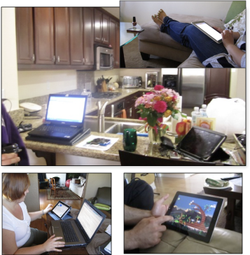
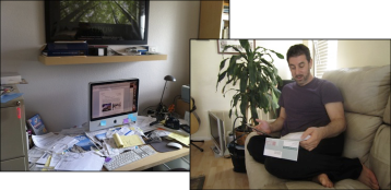
Before sketching a single screen, I ran field studies — visiting 8 homes with iPad owners who were open to using tax software. I watched how and where they used the device in real life. What we found reframed everything.
This single insight became the north star for every design decision that followed. It also gave us our two defining product goals:
File taxes on the couch in 20 minutes. The experience had to support short, interruptible sessions — not a marathon sitting.
90% data-entry free. We couldn't make users type on a glass screen for an hour. We had to eliminate the keyboard as the primary input model.
I conducted three rounds of usability testing across both years, using low-fidelity wireframes so branding didn't interfere with findings. Each round validated a direction or surfaced something that changed it.
From the research, I established a set of design principles that governed every screen, every interaction, every copy choice. These weren't guidelines — they were filters. If a solution violated a principle, we didn't ship it.
Don't port the desktop. Build for the couch. Micro-tasks. Easy resume. Minimum keyboard.
Users needed to know what they were paying for, to whom, and when. No hidden steps.
Tax software earns trust or loses it immediately. The first minute had to feel certain.
Use gestures, animation, and native patterns. Don't build a website in an app shell.
Start on iPad, finish on desktop. Data and state had to follow the user, not trap them.
Not a watered-down app. Full tax support — 1040 through complex returns — on day one.
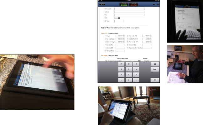
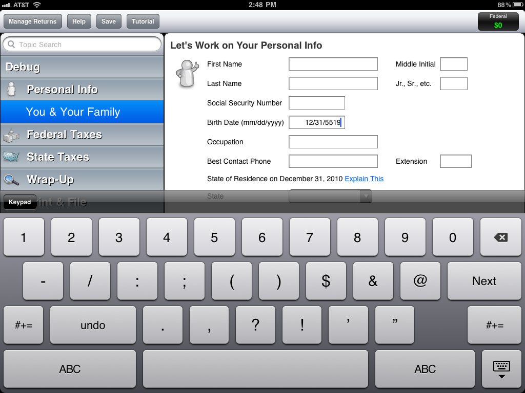
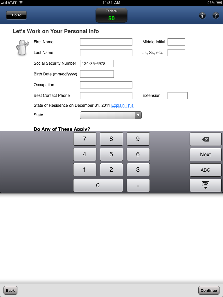
Tax law required users to acknowledge every screen before continuing — we couldn't use swipe navigation. But we could control what keyboard appeared. I designed contextual keyboards that matched each field type: numeric pads for SSNs, date pickers for dates, dropdowns replacing free-text wherever possible. This alone achieved our 90% data-entry reduction goal.
I designed and tested 6 navigation variations. The winner: anchor the nav bar to the bottom of the screen, and only reveal the Continue button after the user has scrolled through all content — enforcing acknowledgment without blocking progress. This was a novel pattern at the time, now common in mobile forms.
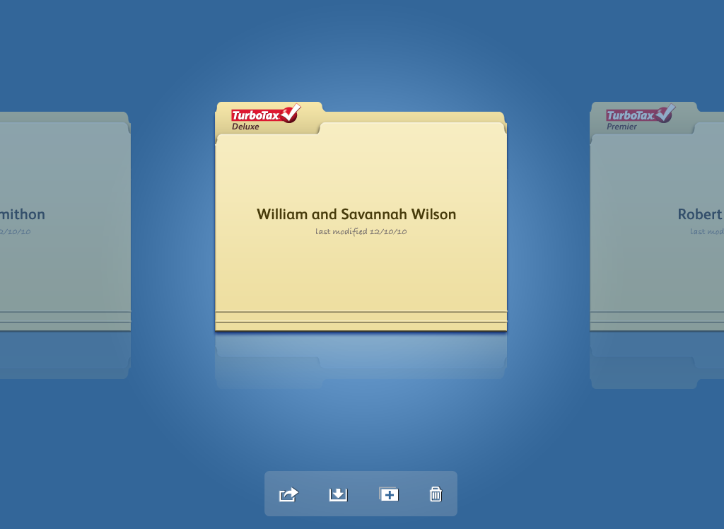
Research showed users were anxious about their tax data being visible on a shared device. I chose a skeuomorphic folder design for the Tax Return Manager: it looked like a physical folder on a desk. Closed, it showed only the return name — no financial data visible. The metaphor created immediate security intuition without requiring any explanation.
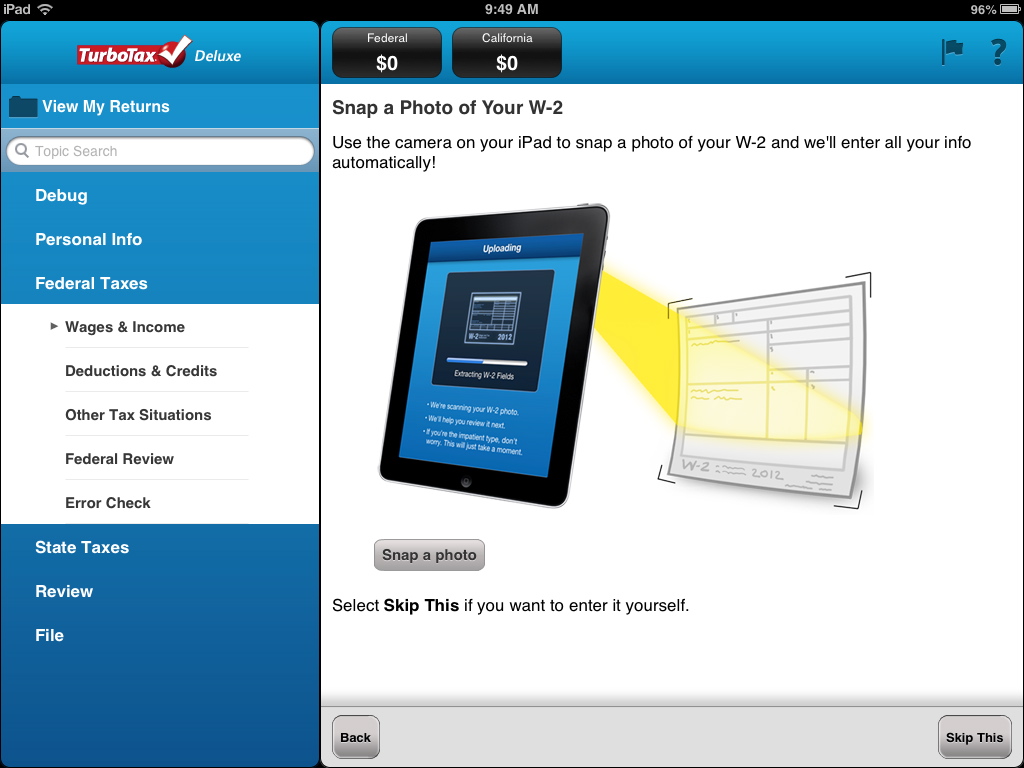
In year two, I introduced W2 photo capture using OCR. Users snap a photo of their W2 and the data populates automatically. I designed and tested the capture flow, button placement for one-handed holding of a large device, and the confirmation screen — finding that showing all pre-populated fields (not a static confirmation page) gave users the fastest way to verify and edit.
Beyond the product, my interaction design patterns became the standard reference for TurboTax's iPad work going forward. I trained support teams on how to handle a device with no file system, briefed marketing on App Store positioning, and worked directly with Apple to demonstrate that this was a full, uncompromised tax product — not a watered-down mobile app.
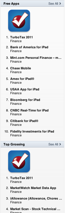
TurboTax became the #1 grossing finance app in the App Store three seasons running. Apple featured us as a design innovation example. The product held a 4.5-star rating across all three seasons.
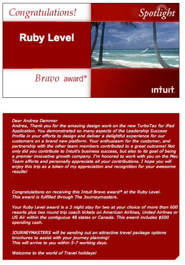
"You demonstrated so many aspects of the Leadership Success Profile in your efforts to design and deliver a delightful experience for our customers on a brand new platform. Not only did you contribute to Intuit's business success, but also to its goal of being a premier innovative growth company."
The Ruby Award is given to fewer than 20 employees annually out of 40,000+ — Intuit's highest recognition for exceptional business impact. I received it for the TurboTax iPad work.
Honestly? The decisions held up. What I'd bring today isn't different choices — it's faster signal. The home visits and three rounds of usability testing that took weeks, I could now augment with behavioral data patterns and AI-assisted synthesis to compress that cycle significantly. I learned this while building Everyday Hum: platform shifts don't wait for perfect. You move fast and forward. I felt that in 2010 with the iPad. I feel it now with AI.
That I thrive at the edge of a platform shift — where there's no playbook and someone has to write the first one. I'm most useful when the problem is genuinely unsolved: when the complexity is real, the constraints are hard, and the standard answer doesn't exist yet. That's what drew me to AI systems work. Same instinct, new frontier.