The platform designer and the two sub-teams.
In 2008, two of the top contact drivers on my platform sat on two different sub-teams within the Windows desktop org, each with their own manager. Neither had ever had a designer.
Initiative 1: Getting Started team: The MSI installer migration (replacing InstallShield), the update and patching experience, and the desktop download flow. This team was responsible for the first thing every TurboTax user touches: getting the product onto their computer.
Initiative 2: States team: The State Download flow. Eleven screens, a mandatory computer restart mid-return, and the number three support contact driver across the entire TurboTax product.
Because I owned both, I didn't need to coordinate with another designer. I didn't need a handoff or an alignment meeting. I could see the whole system. And that's exactly why the solution worked.
Platform designer for TurboTax Windows and Mac Desktop. Both interaction and visual design. 1 of 5 designers covering all of TurboTax. Sole designer on both initiatives simultaneously.
MSI installer migration, update and patching experience, desktop download flow. Core team: 1 lead engineer, 2 engineers, 1 PM, 1 program manager, plus Andrea. Part of a 40-person desktop org.
State tax download and activation flow. 11 screens, mandatory restart, top-3 support contact driver. Served both current-year filers and prior-year filers needing older products.
Tax season is a hard wall. Both initiatives had to ship before January or wait another year. The MSI migration was new technology for the engineering team . Close collaboration on what was technically possible was required throughout.
Two initiatives. Five problems. All generating calls.
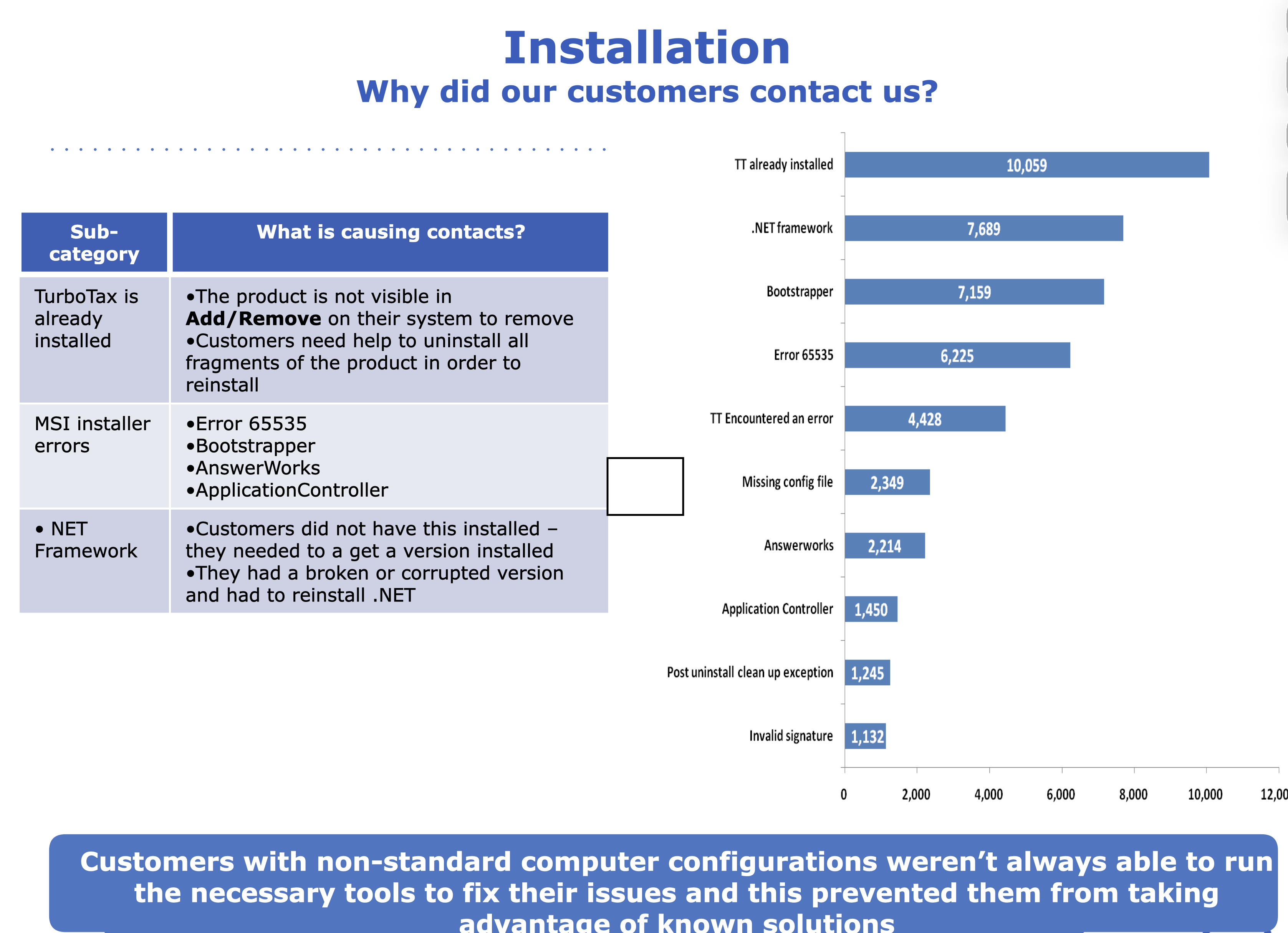
Digging into call center data across 20M+ customer interactions per season, the failure patterns were consistent and clustered around both initiatives.
Initiative 1: Getting Started / MSI Installer
-
01
The installer looked like a Microsoft product The generic InstallShield UI gave users no signal they were starting TurboTax. No brand colors, no friendly tone, no SKU differentiation. Support teams could not even tell which product a caller had purchased because the installer looked identical across all tiers.
-
02
Users were shown screens they did not need to see The install flow was cluttered with screens that required no input and served no user need. Nobody had ever asked: does the user actually need to do anything here, or can we handle it for them?
-
03
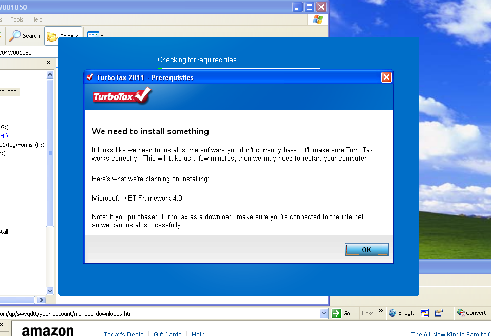
Error messages that told users nothing actionable When installs failed, users saw raw Microsoft error codes : 1601, 1603, 1635, 65535, with no plain-language explanation and no next step. .NET failures, Norton security blocks, and system requirement mismatches were the top drivers. A fatal error with nothing to do is a guaranteed support call.
Initiative 2: State Download
-
04
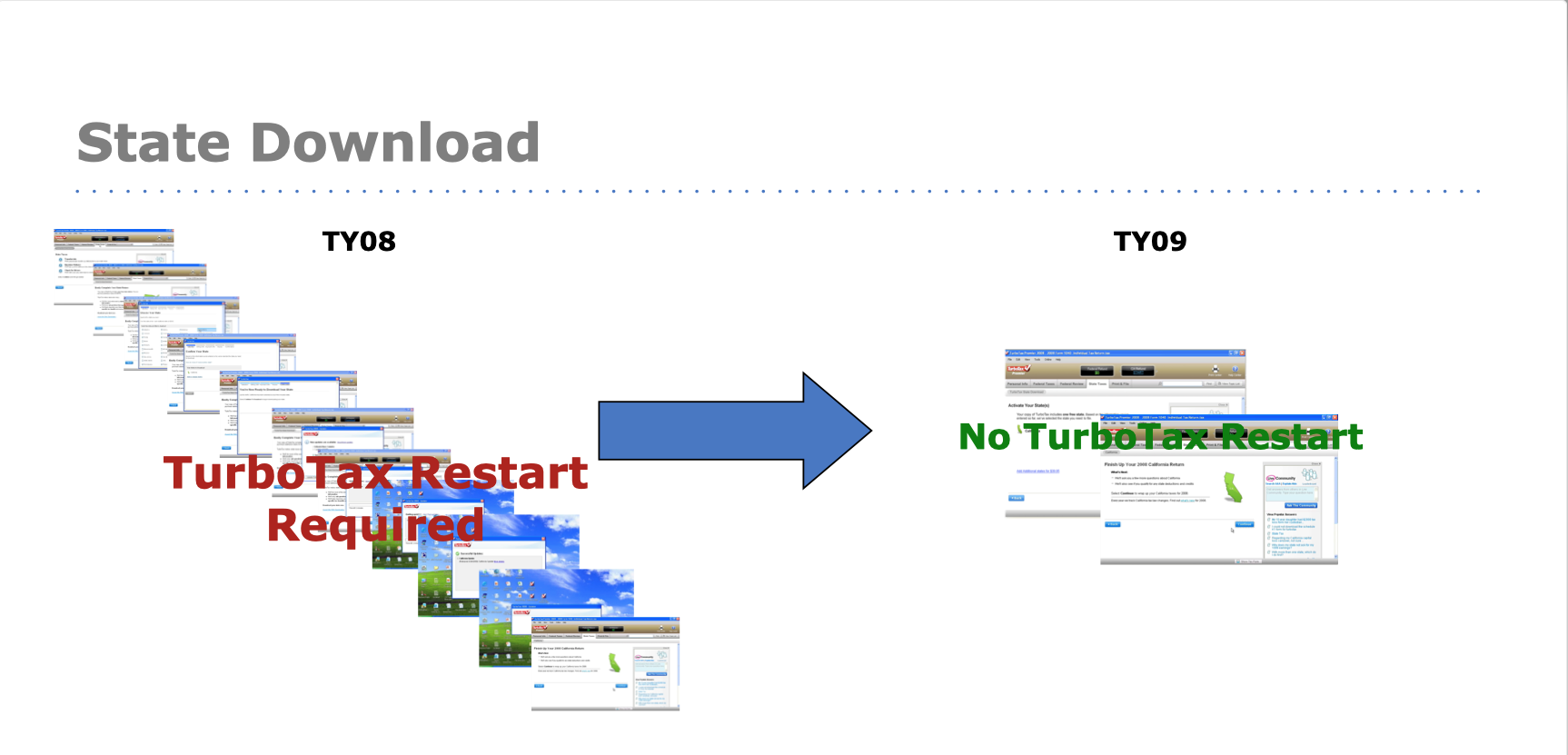
State download triggered a surprise computer restart Getting your state taxes required a full system restart with zero warning. Users lost work mid-return, panicked, and called support. The flow had 11 screens and a mandatory restart baked into the middle of it.
-
05
State download was placed at the wrong moment The original flow prompted users to download their state at the very beginning of installation . Before they had even started their federal return. Users had no idea what state they needed. Wrong-state selections caused a cascade: the free token got used on the wrong state, the user later discovered the error, tried to download the correct state, got charged, and called support.
20 million interactions. One question driving every decision.
The signal was already there : the call center had been capturing 20M+ customer interactions per season across phone, chat, email, and self-service. The engineering team and product manager had already bucketed the top contact drivers. My job was to take those buckets and figure out what design could actually fix.
I also partnered with Intuit's Inner Circle , long-time TurboTax power users, many with tax prep backgrounds, who had been with the product since the beginning. They were detailed, vocal, and exactly the kind of users who would notice if the progress bar text was vague. Their sessions surfaced the behavioral insight that reshaped the entire state download approach.
This reframed everything. The goal wasn't to give users more control. It was the opposite: do as much as possible for them silently, and only surface information when they genuinely need to act. The question we ran every screen through was: can we do this for the user? If yes, do it in the background. If not, explain it clearly and give them a next step.
The team had a running joke about it. They'd see me coming and say: "Here comes Andrea : she's going to ask us what the user actually needs to take action on." That question drove almost every design decision across all three workstreams.
What changed, and why.
Initiative 1: Getting Started / MSI Installer
MSI gave us design freedom InstallShield never had. The first thing I did was use it: end-to-end SKU-specific branding for the first time. Basic, Deluxe, and Premier each got their own color treatment. Users saw their product's colors the moment installation began, and support teams could immediately tell which SKU a caller had purchased.
The tone changed too. Every label, every message, every button was rewritten in TurboTax's friendly voice instead of the flat Microsoft defaults. The install was no longer infrastructure. It was the first impression.
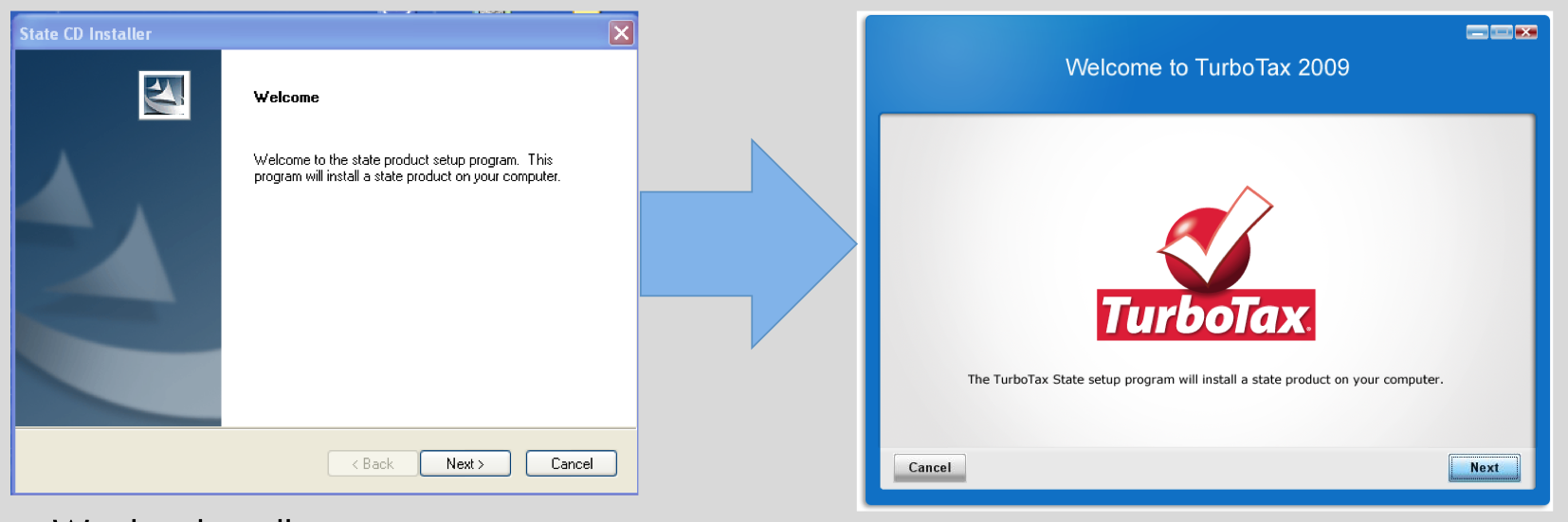
I went through every screen in the installer and asked the engineering team one question: does the user actually need to provide input here, or can we handle it ourselves? Every screen that didn't require a user decision was removed.
What remained: a license agreement (required), update preferences (Automatic / Ask Me First / No internet, rewritten for clarity), install location confirmation, and a final review screen before committing. The Continue button was anchored to the right. Cancel moved all the way to the left. Every layout decision pointed users forward.
The progress bar got a full redesign too. The old one was essentially fake. The technology didn't support accurate timing. We built it to track reality, and added plain-language step labels ("Installing… Patching… Updating…") so users who stayed at their desk could follow along without needing to understand what was happening technically. Static educational content about how TurboTax works ran alongside it, something to read for the paranoid watchers without requiring any interaction. Target: perceived install time under 10 minutes, actual under 5.
Initiative 2: State Download
The original flow prompted users to choose their state at the very start of product installation. We tested this. It failed.
Users hadn't started their federal return yet. They didn't know what state they needed to file in. They didn't know if they lived and worked in the same state. They weren't in the state mindset. They were thinking: I'm about to start my federal taxes. Wrong-state selections caused a cascade: the free state token got used on the wrong state, the user later realized the error, tried to download the correct state, and got charged, because the token was already spent. That triggered refund calls and uninstall requests.
Moving state download to after the federal return, when TurboTax already knew where the user lived and worked from the interview, eliminating wrong-state selection almost entirely and resolved the token problem at the source.
State selection at the start of install. Users guessed. Wrong states, wasted tokens, charges they didn't expect, support calls to fix it.
State download moved to state prep: after federal return. TurboTax already knows the right state from the interview. Confirm and continue.
The original state download flow had 11 screens and required a full computer restart mid-return. The restart wasn't optional. It was baked into how the state installation worked at the time.
The insight that changed everything came from the Inner Circle research: most people do their taxes in multiple sittings. They work on their federal return for a few hours, close it, come back the next day. They don't sit down and file everything in one session.
That behavior was the engineering solution. By moving state download to after the federal interview, where TurboTax already knew the user's state, we could initiate the download silently in the background during the federal return. We bundled it into the existing progress indicators as "state prep" without revealing the specific state name (in case our prediction was wrong). By the time most users reached the state prep tab, the download was already done. No restart required.
For the minority who filed their entire return in one long sitting, we kept the restart, but made it transparent. A "Save Your Work" screen with a "Coming Up" checklist told users exactly what would happen: install state, restart computer, pick up where you left off. The key line was the last one. Knowing TurboTax would resume on its own (not leave them stranded after a restart) made the difference between panic and trust.
End result: 11 screens became 2. A mandatory restart became optional for most users. The #3 support contact driver dropped out of the top 10.
When Microsoft generates an error, it generates a code. 1601. 1603. 1635. 65535. These codes meant nothing to users. The generic message ("A fatal error occurred during installation") made everything worse. Panic, no path forward, and a call to support.
I worked with the engineering team to understand what was actually happening behind each top error code. Most weren't TurboTax problems. They were system problems: outdated OS components, .NET Framework conflicts, anti-virus software blocking registry writes, insufficient permissions. Users blamed TurboTax because that's what they were installing. The real answer was more nuanced.
We rewrote every top error in TurboTax's voice: plain language for what happened, a clear distinction between "this is a TurboTax issue" vs. "this is your computer, and here's how we'll help you fix it," and a concrete next step in every case. A fatal error with a path forward is a recoverable moment. Without one, it's a call.